Objects connected by head and heart
A true aficionado delights in the stories behind everyday objects he curates in his home.
Words: Sophie Lovell
Photography: Hans-Gerd Grunwald
Hans-Gerd Grunwald’s visual memories from his youth, like many of his generation, are marked by the powerful, democratic German design expressions of the 1960/70s, as exemplified by the 1972 Munich Olympic Games and Braun household products.
With the maturing of a keen interest in the history of design and product development, he became something of an expert in the field, through correspondence courses and his own research. The chance to take early retirement from the automobile industry and focus completely on this first great love, saw him turn what was essentially his hobby (of giving guided design tours of museums to friends and acquaintances) into becoming a specialist tour guide at Die Neue Sammlung – The Design Museum in Munich, which is one of the largest and most important museums of applied art in the world.
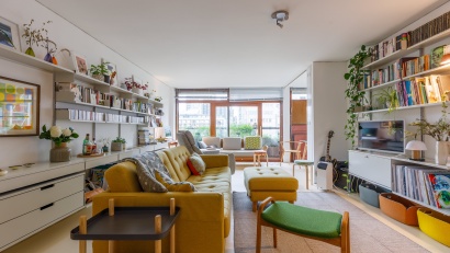
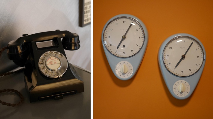
Grunwald moved into his current, modest, two-roomed apartment in the Schwabing district of Munich in 2016. “I developed an interest in having good furniture and started to collect things with a design approach around 25 years ago”, he explains, “that was when I bought my first Wassily chair by Marcel Breuer. Then came scale models of cars, and an AEG electric kettle, by Peter Behrens from 1909, that I found at a local flea market. I also have a collection of 1:6 scale miniature furniture pieces from Vitra. I don’t have the space in my two-roomed flat for all the furniture that I like, so sometimes I buy a model instead.”
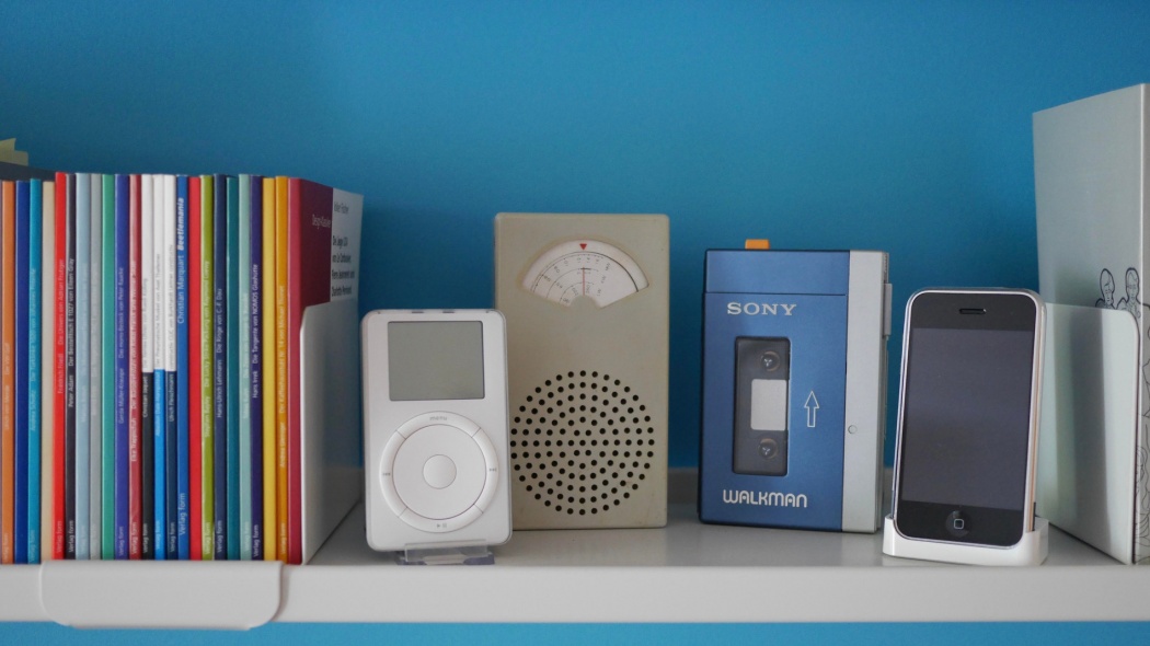
Grunwald’s particular area of interest is in the HfG Ulm (Ulm Design School), which operated from 1953-68. It was founded by Inge Aicher-Scholl, Otl Aicher and Max Bill (a former Bauhaus student). During its short existence, the school was ground-breaking in its rational and systems-thinking approach to industrial design and visual communication. It is also where most of the designers came from that pioneered the design revolution that took place at Braun in the mid-1950s, and strongly influenced a young Dieter Rams in his design approach. One of the first products that really made Rams’s name at Braun was the SK 4 Radio-Phonograph from 1956 that he collaborated on together with Hans Gugelot, who was a tutor at HFG Ulm and a key designer of many Braun products at the time.
Through his work doing the guided tours for the museum, Grunwald also moved towards buying vintage Braun products, such as hairdryers, cameras and shavers. “I have all their shaver models from 1950 up to the ‘Sixtant’ of 1962”, he says, “because it is interesting to see, through them, the development of a product. Sometimes when I do a tour, I take a shaver with me and open it to show how it is made and the intelligence of the design.”
A favourite piece of Grunwald’s is a 1953 compact Rangefinder Werra camera made by VEB Carl Zeiss Jena in the GDR. “What I like about it is that the design is really, really simple. It looks like a Braun object – like it could have been designed by Dieter Rams or Otl Aicher or Hans Gugelot – but it was designed two or three years before the start of the design studies at HFG Ulm by Rudolf Müller. For me, its extraordinarily clean, puristic form, the golden section of the front and the shutter release as just a single control element on the top – kind of like a ‘home button’ – make it a thing to fall in love with. The rest of the controls are protected from the rain and visually tidy on the underside and the protective cap can also be used as a lens hood.”
The story behind Grunwald’s fascination with this camera started with a new exhibition introduced by the Neue Sammlung last year called “The Sound of Design” [“Der Sound des Wirtschaftswunders”], which allows visitors to listen to the sounds of appliances from the 1950s and ’60s on display in the museum. In this collection, there are about ten different objects from the GDR and the Werra camera is one of them. “It came as quite a shock to me”, says Grunwald, “I was born 60 years ago in West Germany and for the first 30 years of my life I lived in a divided Germany. After a further 30 years of living in a united Germany, I realized I could tell you a lot about Scandinavian or Italian design but knew next to nothing about GDR design and production. So, I did some research in the museum library and found out more, also about this camera, and thought ‘I must have it, it’s a really important object’.”
It’s not just objects that are close to Grunwald’s heart, but their context too: the stories and circumstances that surround them. Through context, objects acquire meaning and the user greater understanding. When he was asked to do his tours at the Neue Sammlung, they liked the idea of having someone from the industry to explain industrial design from a completely different point of view from that of an art historian, he says. “When you talk about objects there is the big story relating to the historical style on the one hand, but there are also a lot of small stories from the people who designed and made it on the other. With art, for example, you have one artist that painted a particular picture. With design it doesn’t work like that. An industrial design object is never invented by one person alone. Take the Braun Sixtant shaver, which is famous for its black and silver colour combination. It has this colour because Ewin Braun and Fritz Eichler [Rams’s predecessor as head of design at Braun] really liked some Scandinavian cutlery design from the 1950s that was silver with black plastic handles. So Eichler suggested to Hans Gugelot together with Gerd Alfred Müller, to try that combination with a shaver. After Müller left Braun he went to work for the pen-makers Lamy where he used the same colour combination for his designs there. A product never stands alone. This is what I try to share with my tours.”
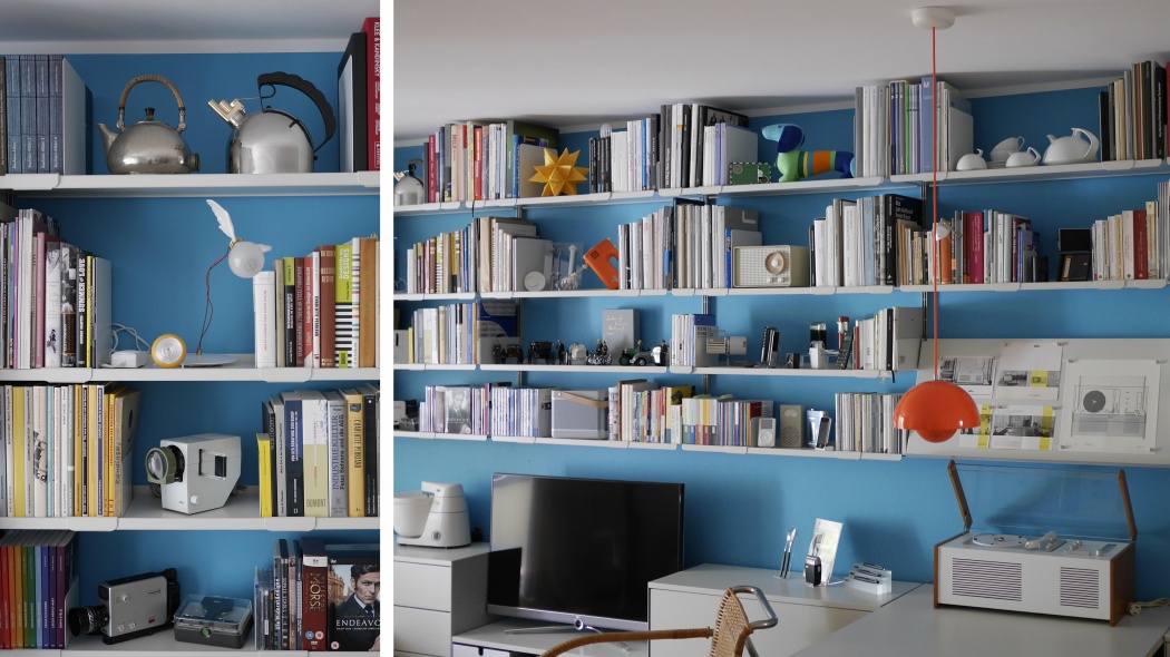
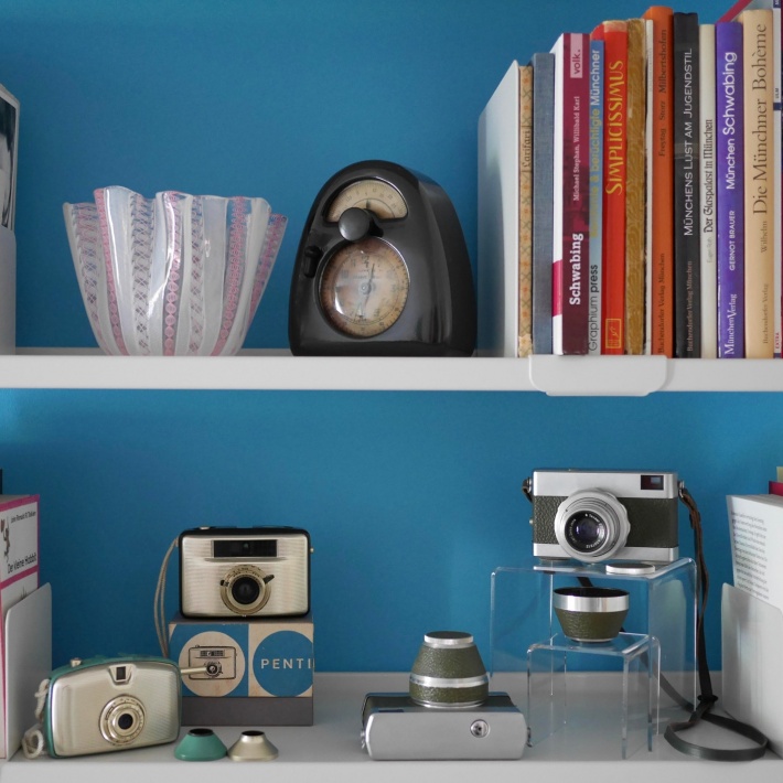
The arrangement of Grunwald’s collection throughout his home is very specific and clearly a lot of thought has gone into where each object is placed. “When you start your professional life with technical drawing, you have to be precise, so yes part of me does like precision”, he says, adding: “It’s a gift but also a burden sometimes. It’s about how I see things and aesthetic compositions. I was always fascinated by Wassily Kandinsky’s work – not so much his paintings as his theoretical works on form such as Point and Line to Plane – because it showed me that there was a concept behind why things work one way and not another. So, over the years I have developed an eye for arrangements. Graphic design for a book, for example, is all about how you arrange things. It’s the same exhibits in a museum or for the contents of your shelves at home.”
Although some of the objects in his collection look factory-fresh, despite their age, others bear the marks of years of use. Dieter Rams is very keen on the traditional Japanese aesthetic of wabi-sabi, which is all about transience and imperfection – it is the idea that an object becomes beautiful through time and use. It might seem a contradiction to apply this term to an industrial object, as against one that is crafted by hand, but what they have in common is that they are both tools for the user. Grunwald explains: “My SK 4 radio-phonograph, for example, is old but it looks new, like fresh from the factory, because it has been repainted over the years. I chose this one because it is a big piece and I wanted to have the same feeling that people must have had in the 1950s about having what was really the first technical object, as against a piece of furniture, in their living spaces. On the other hand, I have a 1955 Braun SK 1 radio, designed by Fritz Eichler and Artur Braun, where you can really see the traces of use over the years and the plastic has discoloured in places. I like this too, precisely because it has been used. It’s 65 years old and has done what it was made for. For me it is a balance, I can live with both of them.”
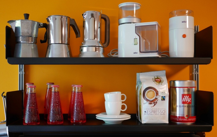
The precision curation of the contents of Hans-Gerd’s shelves extends to his kitchen as well. Even the food packaging appears to be a considered part of the aesthetic. “I did actually buy a whole bunch of Bärenmarke condensed milk cans, which have a distinctive light blue graphic design on the tin, because they contrasted so nicely with the orange wall behind”, he admits. His kitchen shelves are also home to a collection of coffeemakers, including the Moka Express first designed by Alfonso Bialetti in the 1930s, as well as Richard Sapper’s 9090 Espresso maker for Alessi alongside some Braun kitchen appliances, like the coffee grinder by Reinhold Weiss. “All of them look really new”, he says, “but I use them, they are not just for display.”
There are two designers in particular whose work runs like threads through Hans-Gerd’s collection and his research. The first of them is the aforementioned Hans Gugelot (1920-1965), one of the least-known greats of his profession and professor at HfG Ulm, who was stopped short in his prime by a heart attack at the age of 45. “If he had lived longer, I think we would have known much more about him and he would have achieved so much more” says Hans-Gerd. He was incredibly important for the Ulm Design School. The product design there was much more impressive than that of the Bauhaus in my opinion – much purer, much more methodical – and he was responsible for that. He also influenced many students of product design, including Reinhold Weiss and Richard Fischer who went on to Braun. Gugelot was certainly known for his contribution to Braun design, but I think it is a pity that he is not more known more for it. The SK 4 again is a good example for context in this respect. The design is not just Rams, it is not just Gugelot, and it is not just Rams and Gugelot either. It also an idea by Fritz Eichler, it’s a system from Wilhelm Wagenfeld and Gerd-Alfred Müller, it’s a layout from Otl Aicher ... there are seven or eight different people who made their contribution to it. That is how industrial design is. Nobody mentions my name when talking about a BMW, or the name of the engineer who designed part of the engine.”
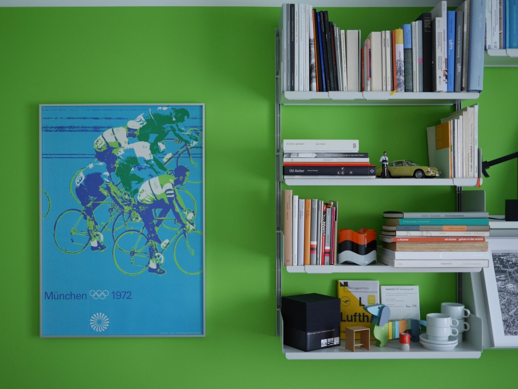
The other important person in Hans-Gerd’s life is the graphic designer and typographer Otl Aicher (1922-1991), so much so that the entire colour scheme of his apartment derives from his work. “As a child I remember Otl Aicher’s designs for the 1972 Olympic Games in Munich being pretty much omnipresent, but it wasn’t until much later that I learned the story behind them”, explains Hans-Gerd. Aicher was a school friend of Werner Scholl, the brother of the German anti-Nazi activists Hans and Sophie Scholl, who were executed by the Nazi regime in 1943. Aicher too was strongly opposed to the Nazis and deserted the army and went into hiding with the Scholl family towards the end of WWII. He later married their older sister Inge Scholl and they both, together with Max Bill, founded the Ulm Design School. “When Aicher became the lead designer for the 1972 Olympics he wanted to create something as far as possible from the Berlin Olympic Games of 1936 under the Nazis, so the colour scheme does not include red, for example, which he felt was the colour of dictators.
“What really fascinated me about his work for the games was this combination of his knowledge and skill in graphic design and the content, or intention behind it – that his decisions were not just aesthetic ones. The 1972 Olympic Games were about showing another kind of Germany to the world. I spent a lot of time researching Otl Aicher, looking through the HFG Ulm archives and talking to people who had worked with him. So when I moved into my apartment, which incidentally is only a few hundred metres away from where Aicher’s design studio was and from where Hans and Sophie Scholl used to live, I decided to make the connection I also have in my heart to his work to the walls of my home by painting each room one of the colours from the Olympic Games: orange for the kitchen, blue for the living room, green for the bedroom/office and silver in the hallway. Silver was the celebratory colour used instead of gold. I also have pictures of some of his early designs on the walls, including one of the Olympic torch relay that I like very much because on one hand all the colours meet in it and in the other hand because he took this thing that the Nazis introduced (the torch relay) and completely changed its representation, stripping it of all the mystification and symbolism the Nazis tried to imply with it.”
So Grunwald’s choice of domestic colour scheme was not just an aesthetic, but a political and ethical one as well. It’s an unusual way to choose the paint for your apartment. But it brings in a lot of layers of context, which is totally in keeping with this design expert’s ethos: the colour scheme, together with the furniture and the objects on display, complete the interior decoration of his flat as a collaboration across time with most of the greats of German post-war design in a precisely perfect way.
~~~
Sophie Lovell is a writer, editor, and creative consultant.